
Asking users for their birthdate on a form is complicated. Birthdates have formats that vary depending on the country and they consist of three separate data strings. It’s easy to confuse and frustrate users if the birthdate field doesn’t use simple controls and isn’t in a clear format.
…
The Clear and Easy Way
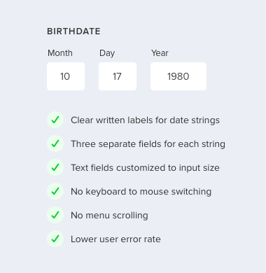
Writing out the label for each birthdate string and separating them into three fields instead of one eliminates the format confusion. Users may have to press the tab key to hop to each field, but if correct user data is important to you, a clear format is essential.
Custom sized text fields are also important for clarity. When you customize each text field to the length of each birthdate string, you’re giving users a visual cue. This signifies them to enter the month number not the month name. It also signifies them to enter the full year instead of abbreviating it (e.g. 80 for 1980) since the year field is wider.Text fields are easier to use than select menus and calendar widgets because desktop users don’t have to switch their hands from keyboard to mouse. Mobile users also don’t have to swipe or tap small targets.
Too Many Choices
The birthdate is a complicated form field to design because there are too many formats and controls to choose from. The way most birthdate fields are designed today is confusing, difficult, and complex. Designers should choose the clear and simple way and leave the other choices behind.…
Curated by (Lifekludger)
Read full article at uxmovement

